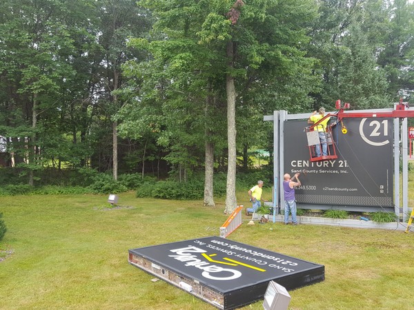
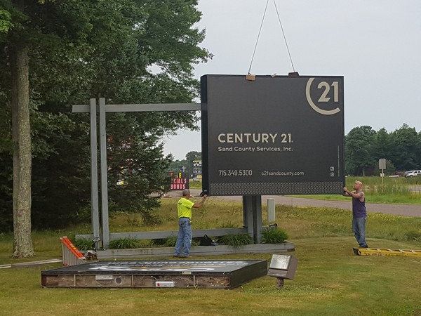
Picture this: You’re a couple of months away from kicking off your big season. The team is tuned up; playing sharp, healthy and looking good. You have a tingling in your bones that you just may have this game figured out. You could take it all the way. Maybe someday, someone will even come to you for lessons on how it’s all done. Then the phone rings. It’s the home office. They’re calling to tell you the team colors are changing and so is the logo. Everything needs to be turned and churned. And they tell you not to worry – you’re going to love it and that you will even thank them someday. Nausea rises. What’s this going to do to the team…and the FANS?
Yup, that’s kind of how it felt when we received the word this winter; CENTURY 21, our trusty and beloved franchise was changing its logo and colors. They called it a rebranding and modernization of our brand’s image. At first knowledge, the blood drained out of our faces – just a little bit. Then we may have grumbled and said a few choice words – just a little bit. But then the more we let the news sink in, the more it began to grow on us. We might even thank the home office one day – just a little bit.
 And so, the turn and churn is underway. The new, more smart, sleek and sophisticated color palette along with the new C21 seal replace the old black and gold colors and logo. It’s not just symbolic, it’s a real opportunity for us to set a new bar, to shine through and to show what it means to be extraordinary real estate agents. It’s an exciting time for our brand and our firm and we accept the challenge: to be relentless, to defy mediocrity and deliver extraordinary experiences. It’s time for kickoff! ~ Wanda Boldon


