Welcome to the second installation of our three-part series relating to “Our COVID Experience”. We’ve already shared information about how things have gone this year from our field of vision as Realtors. But we continue to talk to people who are surprised when we share stories about our real estate market in 2020. Because of that, we feel it’s important (and interesting) to look at the 2020 market from a statistical perspective and compare our feelings to real numbers. It’s the next link in the chain of piecing things together.
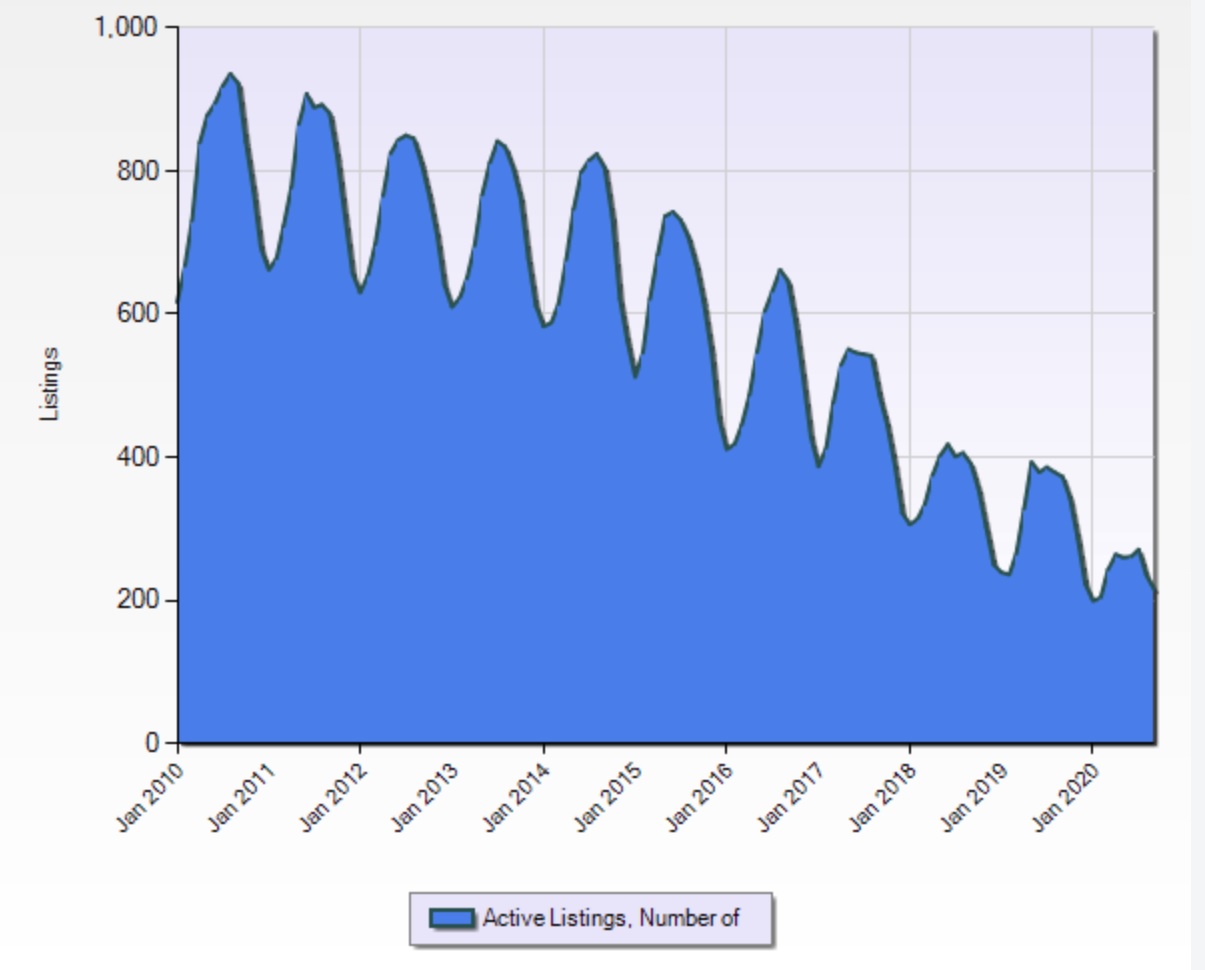
We turned to the Realtors Association of Northwestern Wisconsin and the multiple listing service to pull sales statistics and graphs for our market area. To keep things simple, we started by comparing the first 3 quarters of 2019 to 2020 to see how the two years differed. We expected some drama! Instead, we found the number of properties sold and the average days on the market is almost identical – whether looking at properties off water or on water. What? How is that possible? It hasn’t seemed like that. We met with our team to discuss our findings and the consensus for this head-scratcher had everything to do with inventory. There simply wasn’t (and isn’t) enough inventory for the buyers who are ready and willing to buy. If we would have had 25% more inventory, we would have sold 25% more properties. The graph below shows the dwindling inventory over time for our market to support that.

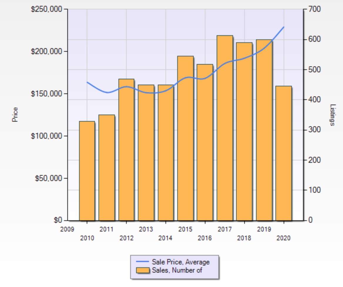
The thing that DID change from 2019 to 2020 was the average sale price. The average sale price in our market area is 10% higher than last year – for both waterfront and non-waterfront properties! That was not a shocker to the team. They’ve all experienced countless competitive offer situations where the winning buyer offered well over the list price in order to be chosen. That’s the power of the market and the effect of attracting many buyers at once. The graph below shows the movement of prices over time, along with the spike from last year to this.

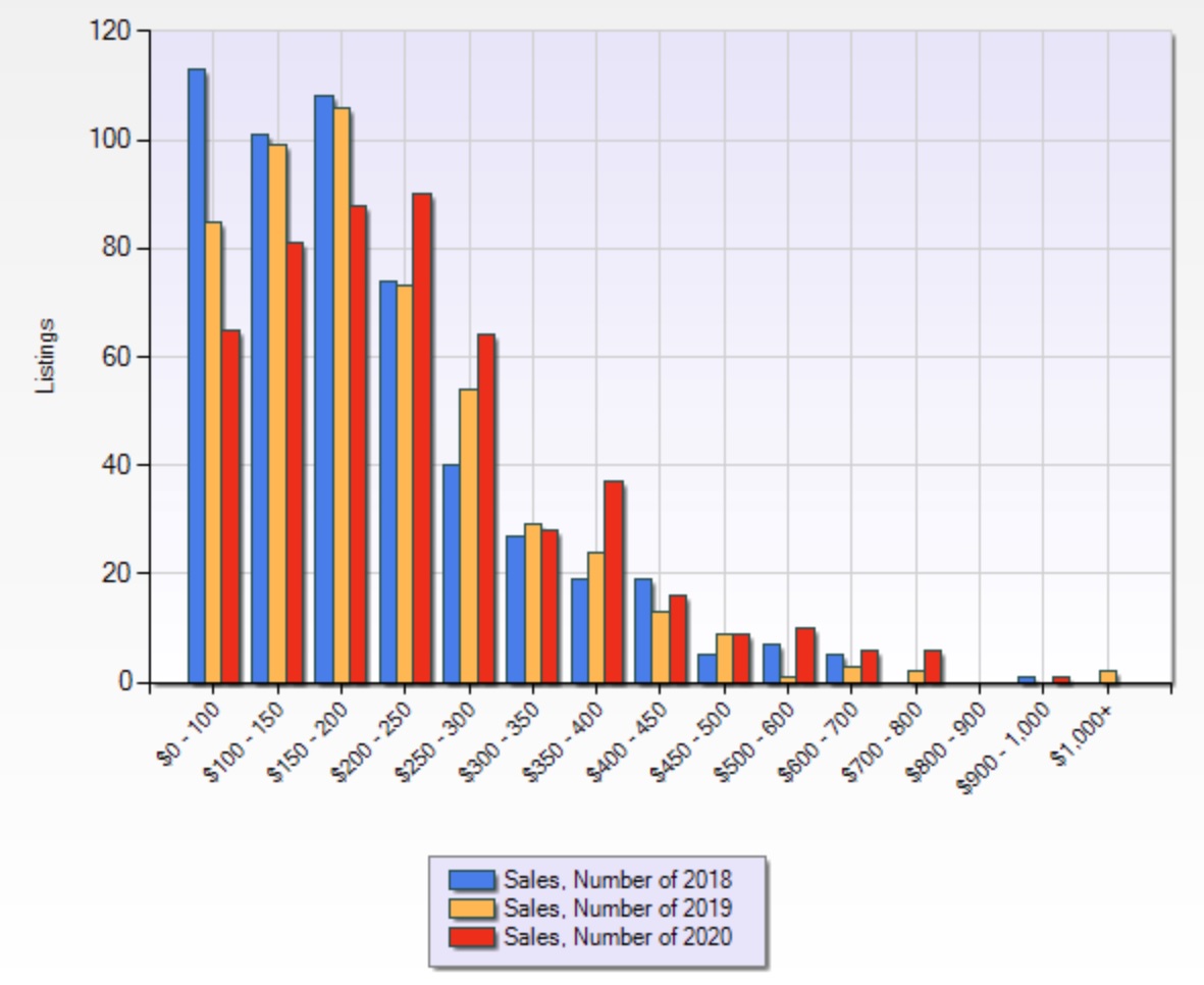
Another thing that jumped out to us was the movement of the “sweet spot” in the market over time. This relates to the movement in pricing. The bar graph below will make you dizzy and cross-eyed, but it also shows this movement. If you squint and focus on one color at a time and then do the same for all the other colors, you can see the shift. Feel free to use this entertainment when you are able to attend a party again.

Lastly, we asked ourselves about the future. What will Q4 look like in 2020? In comparing the number of sales in the last quarter of 2019 to the number of properties that are currently under contract to close in the last quarter of 2020, it’s about the same. It punctuates everything we’re saying to sellers right now. Seasons end, but the real estate market does not. We’re here to play all four quarters and unleash the power of the market all through the year! ~ Wanda Boldon
